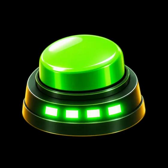
A game about timing could easily look like a clock: a stopwatch face, a bedside alarm, a sports timer. Stopify doesn’t, on purpose. It looks like a stop-the-light machine at an arcade, the kind with a bulb-lit sign and a big round button you slap. Here’s why, and what that decision changed.
A machine, not an instrument
A clock is something you check. An arcade machine is something you play with friends standing round it. That’s the feeling we wanted at a party: one lit cabinet, a crowd, and a button. So the app is drawn as that cabinet. The home screen is the front panel, the games are keys on a control deck, and the timer sits behind dark glass like the display on a real machine.
Made of your light
The cabinet comes in four lights: green, red, yellow and blue. Pick one and the whole machine takes it on, from the panels and rims to the glass, the bulb sockets and the keys. There’s no fifth colour. Gold is kept for the jackpot, a Perfect! stop or a win, so when it appears it means something.
There are no drop shadows and no gradients on any surface. In a dark arcade, nothing floats; things glow. So the only lift in Stopify is light: bulbs, lit digits and lamps.
Digits behind glass
Every time in the game sits on the same 88.88 face, four segment cells with the point between the second and third, set in a fourteen-segment display font. The unlit segments show faintly, the way they do on a real display. When the clock goes dark, you still see the ghost of the face, waiting.
Nothing to count along with
The most important design rule isn’t about colour at all. While the hidden clock runs, nothing on screen keeps a beat: no pulsing button, no ticking animation, no spinning light. If anything moved in rhythm, you could count along with it, and the game would be about watching instead of feeling. Motion in Stopify is light switching on and off in place, and soft fades. Nothing bounces.
Results in words
A stop 0.04 late isn’t “+0.04” in red. It’s “0.04 late”, in plain cream text. Early and late are equally good or bad in most modes, so painting one as a loss would be telling you something untrue. The verdict word, from Perfect! down to Miss, carries the colour instead.
Two voices
Stopify talks in two typefaces. Titan One shouts: the sign, the keys, the verdicts and the big numbers. Nunito talks: sentences, labels, the small print on the deck. Both are open-licensed and ship inside the app, so the game looks the same with or without a connection.
This website is built from the same cabinet. If it feels like you’re standing at the machine, that’s the idea.